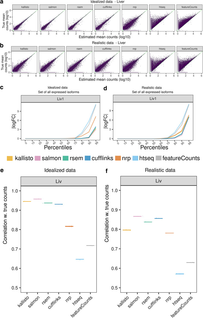
Fig. 2.
Comparison of estimated quantification with the truth in simulated data. A, B Scatter plots between the inferred and true counts. Each point represents the average expression of three samples. A Idealized data, B realistic data. C, D Percentiles of the |logFC| (relative to true counts), for the set of expressed isoforms in sample 1 in C idealized and D realistic data. A point (x,y) on a graph means x% of the transcripts have |logFC|< y. For clarity, all unexpressed genes were removed. Unexpressed isoforms were retained if a sibling isoform is expressed. A logFC of 0 means the estimated count is equal to the truth for that isoform. E, F A point on this plot shows the Spearman correlation between the vector of inferred quants and the truth. For each method, the correlation was calculated for each of the three samples, plotted as a box plot. Variation is low, so box plots are thin

