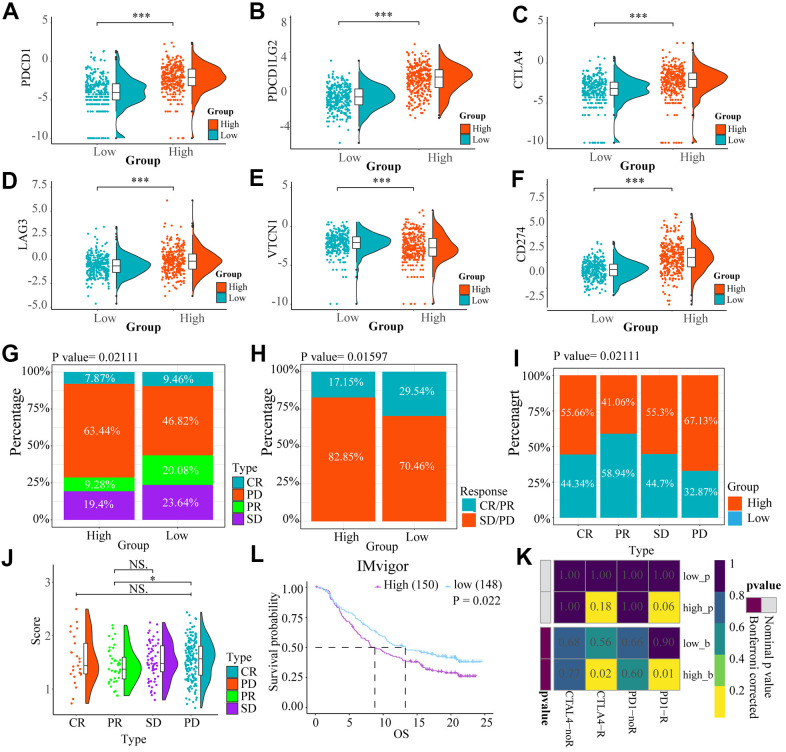
Figure 7.
The heat maps (A–F) showed the different expression conditions of immune checkpoints in low and high-risk groups. (G, H) The bar charts showed the distribution of the prognosis of cases in high and low-risk score group based on IMvigor datasets. (I, J) These pictures showed the risk score distribution of cases with different prognosis in IMvigor datasets, (L) The OS of cases in high and low risk score groups from IMvigor dataset. (K) Submap analysis indicated that patients with high risk score could be more responsive to anti-CTLA-4 (Bonferroni corrected P = 0.02) and anti-PD-1 therapy (Bonferroni corrected P = 0.01) based on TCGA datasets. NS. p > 0.05, * p < 0.05, *** p < 0.001.

