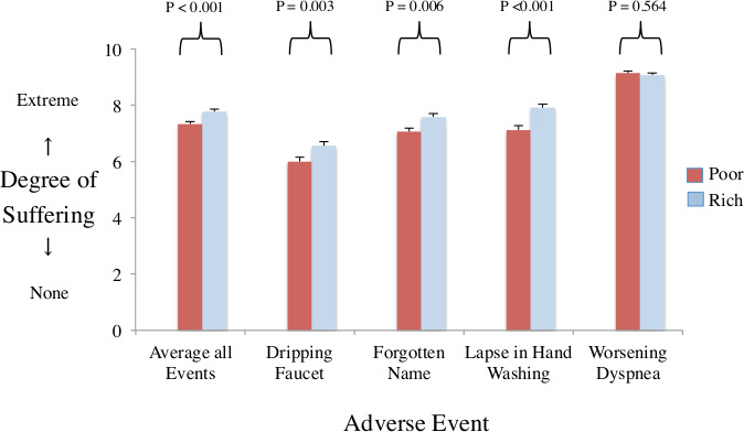
Figure 3.

Perceptions of patient suffering plot shows mean ratings of patient suffering from survey of clinicians (n=494). X-axis denotes average of all adverse events and the four specific components (dripping faucet making noise, forgetting patient name despite being in hospital for days, failures of hand washing when entering room and worsening dyspnoea). Y-axis denotes mean ratings of patient suffering. red bars for survey describing a poor patient. Blue bars for survey describing a rich patient. Vertical beams denote standard errors. P values compare mean ratings of same adverse event. Results show significantly lower mean ratings of suffering in the poor version than rich version (exception of dyspnoea).
