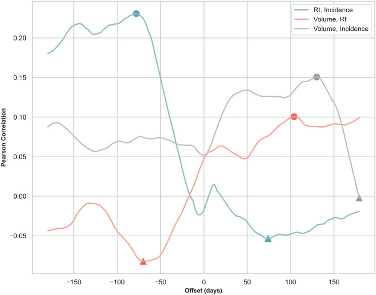
Figure 3.
Time-lagged cross correlation (TLCC) among selected time series. This figure depicts TLCC among selected time series for an offset from − 180 to 180 days. The solid blue line shows the TLCC between the daily effective reproduction number and the daily reported incidence count. The solid red line shows the TLCC between the daily policy volume and the daily effective reproduction number. Finally, the solid gray line shows the TLCC between the daily policy volume and the daily incidence count. All calculations are averaged over the TLCC of each country from the first count until 31 Dec 2020. The filled circles and triangles indicate the peak correlations (the maximum positive correlation or the minimum negative correlation) between two series.

