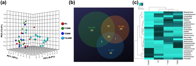
Figure 5.
Bacterial characteristics at the genus level taxa. (a) PCoA plot, based on Bray Curtis distance matrix, showing significantly different clustering of Type 3c diabetes (Light blue dots) compared to the other groups (Red dots- healthy control, Green dots- Type 1 diabetes, Deep blue dots- Type 2 diabetes). (b) Venn diagram showing the numbers of unique and common genera between the three diabetes groups. (c) Heatmap with clustering dendrograms depicting the group wise difference in abundance of the organisms at the genus level taxa. The colour intensity representing the median relative abundances is based on the row z scores.

