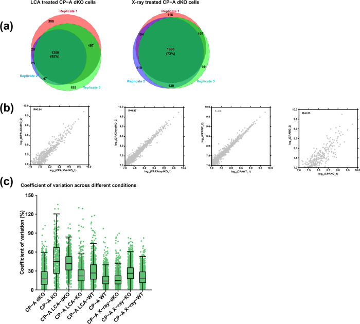
Figure 2.
Qualitative and quantitative comparison of the identified proteins between replicates. (a) The area-proportional Venn diagrams illustrate the proportion of shared and unique proteins between technical replicates. (b) Scatter plots showing Pearson’s correlation coefficient between logarithmically (log10) transformed quantile normalized LFQ values of the corresponding replicates. (c) A boxplot representing the distribution of coefficient of variation for quantile normalized protein intensities across different experimental conditions. Each dot represents the CV of an individual protein intensity within each sample type.

