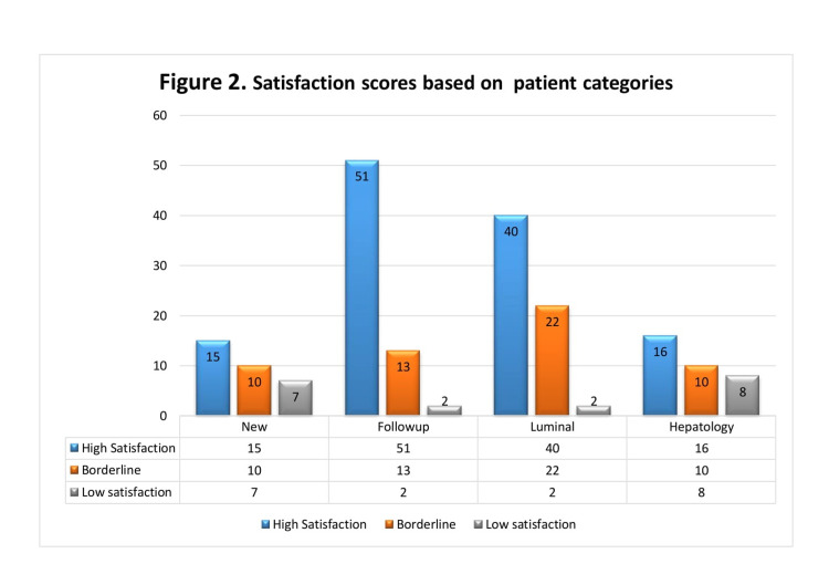
Figure 2. Satisfaction scores based on patient categories.
X-axis represents patient categories and Y-axis represents the number of patients.
Colour bars represent different satisfaction scores as follows:
Blue = high satisfaction scores (4-5 on Likert scale)
Orange = borderline (2-3 on Likert scale)
Grey = poor satisfaction (<2)

