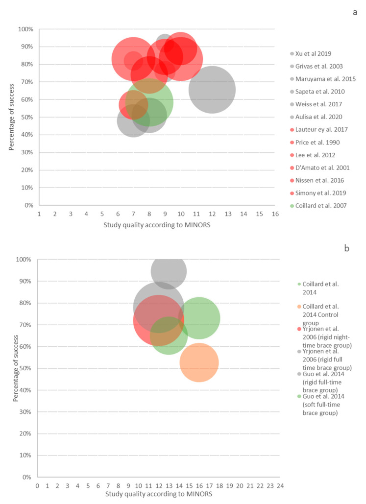
Figure 3.
The bubble graph represents the proportion of the population with less than 5° Cobb angle progression (Y axis) relative to the MINORS score (X axis) and sample size (diameter of the circle). Thirteen non-comparative studies are represented in (a) and three comparative studies in (b). The grey color represents the rigid full-time concept, the red color the night-time concept, the green one the soft concept, and the orange color represents the control group [4,5,22,24,28,31,34,35,37,39,40,41,44,45,46,51].

