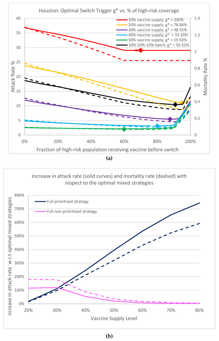
Figure 4.
(a) Plot of overall attack rate and mortality rate (evaluated on Day 360) as a function of percentage of high-risk coverage. . Red, yellow, purple, blue and green curves correspond to, respectively, 10%, 20%, 30%, 40% and 50% uninterrupted vaccine supply inventory. The black curves show the batched 30% vaccine supply with delay: 10% arrived on Day 0, Day 30, and Day 60. Solid curves denote attack rates, dashed denote mortality rates. Points marked on the curves indicate the associated optimal switch trigger. (b) This graph shows the rapid increase in attack rates (solid curves) and mortality rates (dashed curves) for full prioritized strategies with respect to the optimal mixed strategies as more vaccine becomes available. It also shows that there is more urgency to open up more vaccines to the general public.

