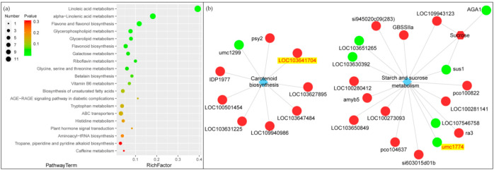
Figure 7.
Enrichment analysis of metabolic pathways of different metabolites based on KEGG database (a). p-value in the metabolic pathway is the significance of enrichment of this metabolic pathway, and the significant enrichment pathway is selected to draw the bubble chart. The color from red to green indicate a continuous decrease in p-value. The scale of dots represents the number of metabolites. In the KGML network diagram of genes and metabolites (b). The circle represents the protein, the hexagon represents the metabolite, and the diamond represents the pathway name. Red indicates up-regulated proteins or metabolites, while green indicates down-regulated proteins or metabolites.

