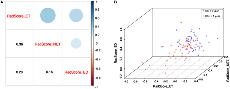
FIGURE 4.
(A) The correlation between each RadScore. The lower corner shows the Pearson correlation coefficients and upper corner indicates the correlation degree. (B) The scatter plot shows patients with short (<1 year) and long survival (≥1 year). X, y, and z axis represents RadScore-ET, RadScore-NET, and RadScore-ED, respectively.

