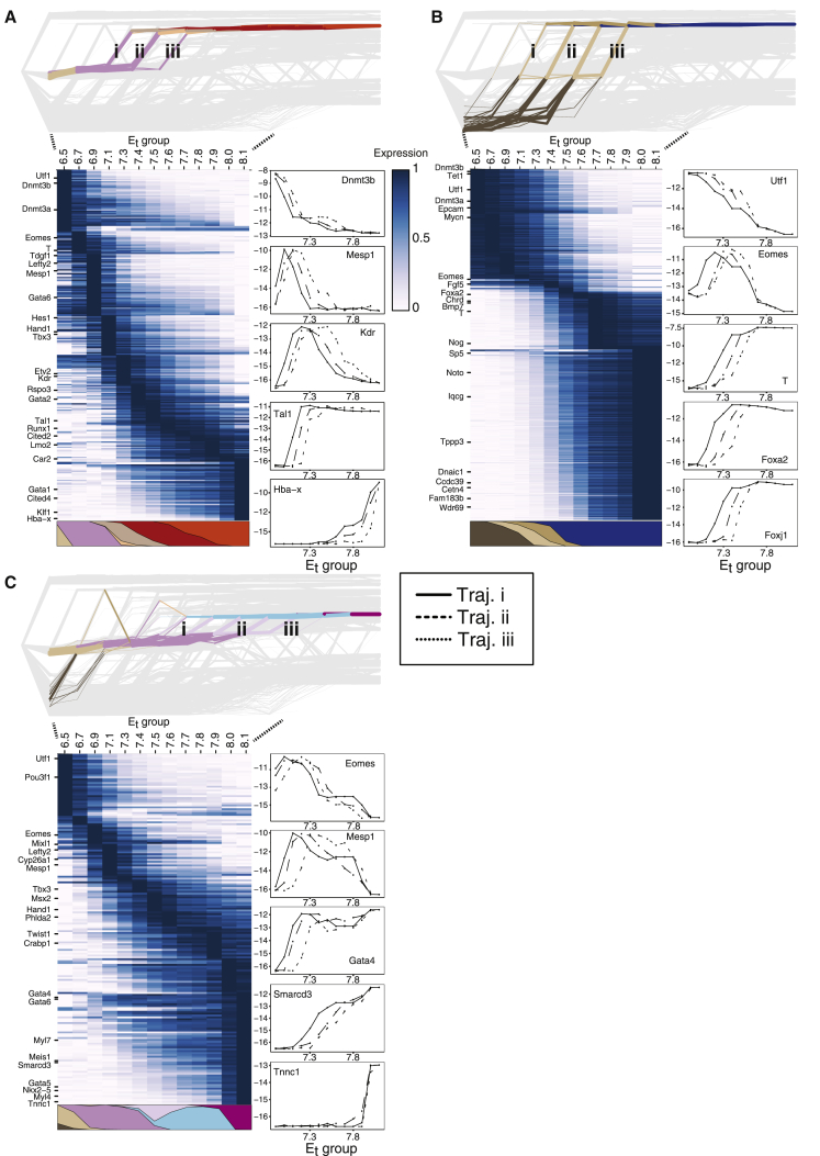
Figure 3.
Traceback of differentiation fates and their expression kinetics
(A–C) Flow tracebacks were performed from (A) erythroid 2 (MC#1), (B) node/notochord (MC#367), and (C) cardiomyocyte (MC#57) states. Network plots depict traced-back flows color-coded by annotated cell types and labeled (roman numerals) according to key temporal trajectories. Heatmaps show average expression kinetics for genes with the highest variance over the trajectories. Colored polygons represent the cell type composition of the traceback at each time point (combining the trajectories). Line graphs show the absolute expression level (log2 of UMI frequency, y axis) for select marker genes, along each of the trajectories shown in the respective network plot.

