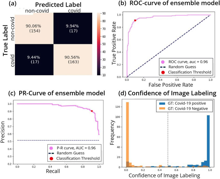
Fig. 2.
Performance of the model. a Confusion matrix of the classification. True positive rate (TPR) at the bottom right corner, true negative rate (TNR) at the top left corner, false positive rate (FPR) at the top right corner, and false negative rate (FNR) at the bottom left corner. b Receiver operating characteristic (ROC) curve. The curve shows the relation between true positive rate (TPR) and false positive rate (FPR) as the threshold of the separation between positive and negative classification is varied. The performance of the model is measured by the area under the curve (AUC). Ideally, the curve should cover as much area as possible up to the upper left corner (AUC score of 1), which minimizes the FPR while maximizing the TPR. The AUC is 0.95. c Precision-recall curve. Shows the relation between precision and recall. Precision and recall are affected from different classes of the data, thus can vary in scores when data is imbalanced (e.g., more observations of positive or negative compared to the other). We would like to have the AUC as large as possible up to the upper right corner, which maximizes both precision and recall. d Classification score histogram. Ground truth (GT) labels are in colors. Every image is scored on a scale between 0 and 1 with threshold of 0.5, seen as a dashed line, such that all images with a higher score will be classified as positive for COVID-19 and images below as negative. Negatively labeled images that received a score above 0.5 are, therefore, incorrectly classified images, and vice versa with respect to positively labeled images. However, the closer the image score is to one of the edges (0 or 1), the stronger the confidence in the image’s classification. The accumulation of two distinct colors on the edges point to good separation of many observations with strong confidence in the classification

