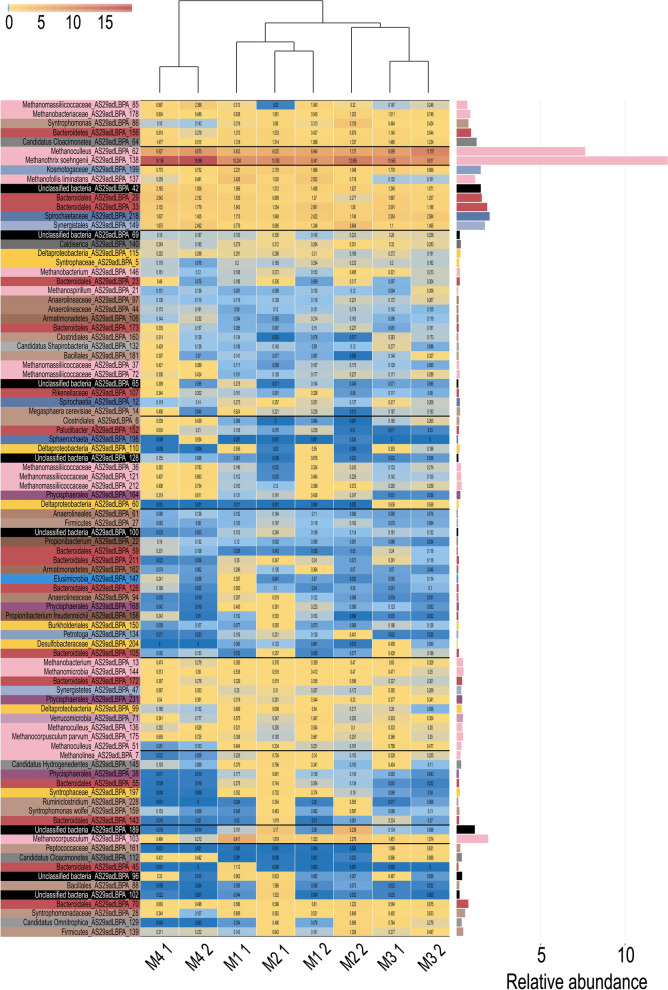
Fig. 9.
MAGs relative abundance. Relative abundance of MAGs represented as a heat-map with colors ranging from blue (rare MAGs) to red (most abundant MAGs). Colors reported in the left part are according to the taxonomy at phylum level. The tree shown in the top part of the figure represents the distance among coverage profiles. The bar plot on the right shows the average relative abundance of the MAGs measured in the different experiments. M1_1 and M1_2 denote bioreactor M1 Experiment 1 and 2, respectively; M2_1 and M2_2 denote bioreactor M2 Experiment 1 and 2, respectively; M3_1 and M3_2 denote bioreactor M3 Experiment 1 and 2, respectively; M4_1 and M4_2 denote bioreactor M4 Experiment 1 and 2, respectively;

