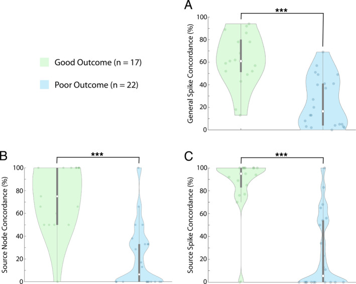
Figure 4.

Comparing concordance measures between good and poor outcome patients. Comparison of the three concordance measures between patients in the good outcome group and patients in the poor outcome group. (A) General spike concordance compared between the good outcome groups and poor outcome group (p < 0.001). (B) Source node concordance compared between the good outcome group and poor outcome group (p < 0.001). (C) Source spike concordance compared between the good outcome group and poor outcome group (p < 0.001). Data shown are from the first 1‐h epoch for all patients. Each white dot represents group median, and gray bars represent interquartile range
