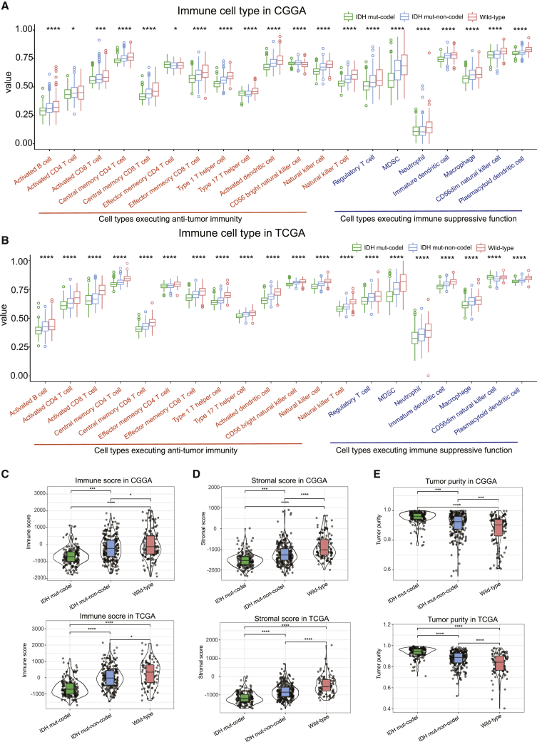
Figure 2.
The proportion of immune cells and immune score in each subtype
(A and B) Boxplots represent the differential distribution of immunoreactive and immunosuppressive cells in the various LGG subtypes identified in CGGA (A) and TCGA (B) databases. (C–E) Violin plots show the median, quartile, and kernel density estimations for each immune score (C), stromal score (D), and tumor purity score (E). The black horizontal line represents the median score for each subtype, and the edges in the box represent the upper and lower quartiles in the dataset. The violin graph can also reflect the data density, where a more concentrated dataset yields a broader graph. p values were determined using the Wilcoxon or Kruskal test (∗p < 0.05, ∗∗p < 0.01, ∗∗∗p < 0.001, ∗∗∗∗p < 0.001).

