
Figure 3. Use cases demonstrating the common steps for using CovidExpress.
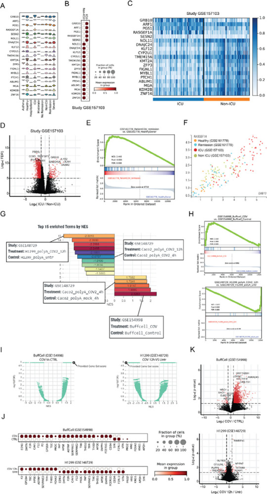
A Use case1: CovidExpress violin plot showing the expression of the top 20 COVID-19 severity predictors as defined by Overmyer et al (Overmyer et al., 2021) in the available severity classes available in CovidExpress.
B CovidExpress dot plot showing the expression pattern of the top 20 COVID-19 severity predictors in Overmyer et al dataset (GSE157103).
C CovidExpress heatmap showing the detailed expression of the top 20 COVID-19 severity predictors in Overmyer et al dataset (GSE157103).
D Volcano plot showing the transcriptome-wide differential expression results as calculated by CovidExpress of ICU vs Non-ICU samples from Overmyer et al dataset (GSE157103).
E CovidExpress GSEA plot showing the enrichment the upregulated genes from the ICU samples of GSE157103 in the remission patients from GSE161778.
F CovidExpress scatter plot showing the gradual distribution of samples based on their COVID-19 severity using two top COVID-19 severity predictors.
G Use case2: CovidExpress GSEA ranking plot of the list of experiment showing the most enriched and depleted expression of the coagulation genes (GO:0030193).
H CovidExpress GSEA plot of the experiments showing the most enrichment and depletion of the expression of the coagulation genes.
I CovidExpress GSEA volcano plot comparing the NES and FDR scores of the coagulation geneset relatively to the other contrasts in the samples identified in figure H.
J CovidExpress dot plot showing the expression pattern of the coagulation genes in the experiments identified in panel H.
K Volcalo plot showing the identification of additional differential genes between the previous two experiments using CovidExpress differential gene expression feature.