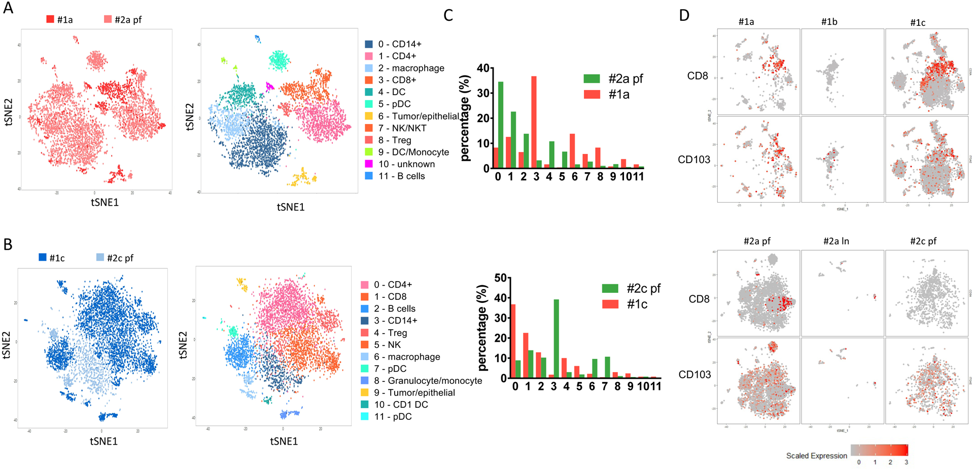
Figure 3. Comparison between patient #1 and patient #2 biopsies.

(A) Comparison of baseline samples between patient #1 (#1a) and patient #2 (#2a pf) collected before the treatment. Left panel, combined tSNE plot analysis of #1a and #2a pf. Red, #1a; pink, #2a pf. Right panel, annotation of tSNE plot for each cell subpopulations. (B) Comparison of after treatment samples from patient #1 (#1c, dark blue) and patient #2 (#2c pf, light blue). The tSNE plots are colored by either cell group (left panel) or subpopulation annotation (right panel). (C) Cell number counts for each cluster identified and shown by absolute cell count (upper panel) or percentage (lower panel). (D) TRM infiltration in each sample collected from patient #1 and patient #2. CD8 and CD103 (ITGA) expression levels on each cell from individual samples collected from patient #1 (upper panel) and patient #2 (lower panel).
