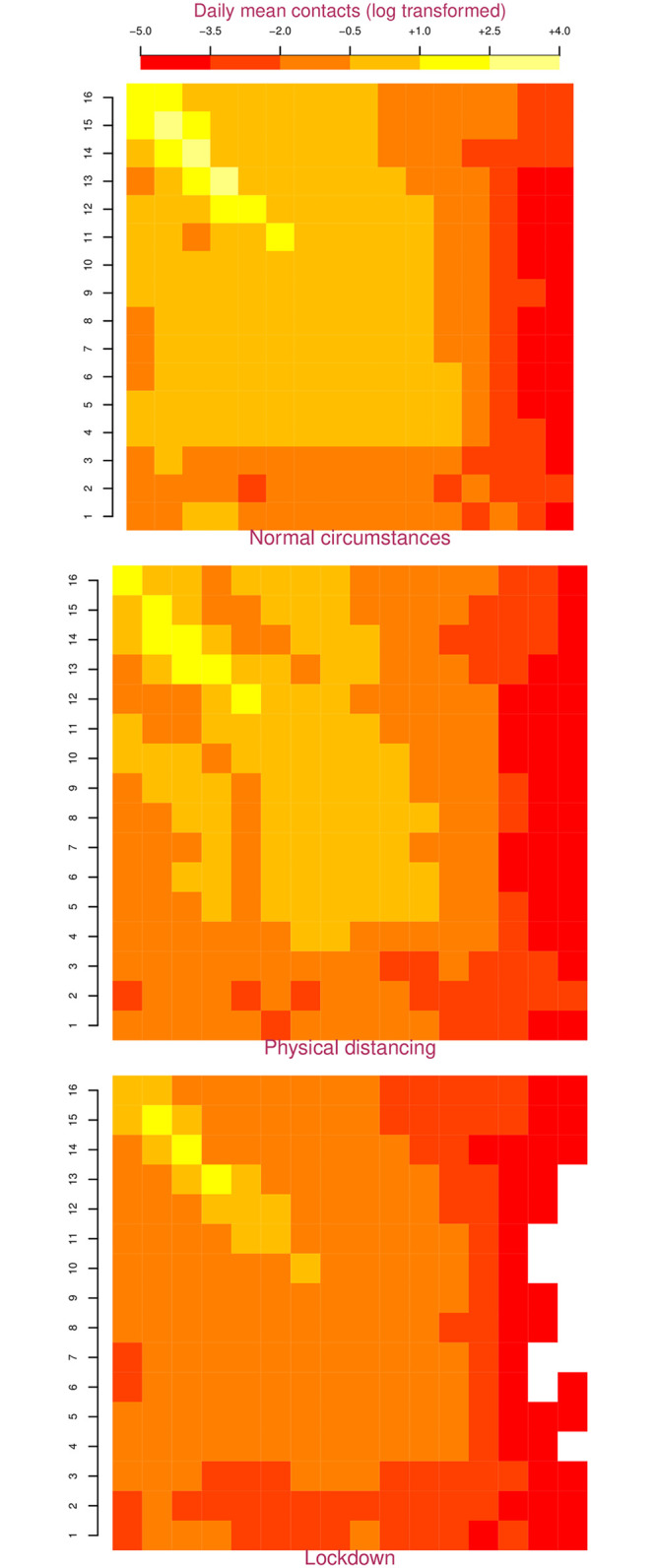
Fig 1. Age and intervention specific contact matrices for Nepal.

In these matrices, the population is divided into 16 5-year age-groups represented along the two axes that start at the top left. The top left square represents contacts between 0–4 year olds and the bottom right square represents contacts between individuals who are 75 years and older. Colors in the squares represent the log transformed mean daily contact rate between corresponding 5-year age-groups cohorts. Dark/red colors represent fewer contacts, light/yellow colors represent a greater number of contacts. Physical distancing causes the lighter squares to darken indicating fewer contacts, while a lockdown causes the lighter squares to darken even further.
