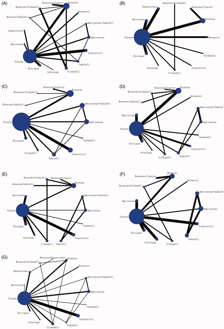
Figure 3.
Network diagrams of comparisons on seven outcomes of different treatments in patients with pulmonary arterial hypertension. (A) 6-Minunt Walking Distance(6MWD) Change. (B) Mean Pulmonary Arterial Pressure (mPAP) Change. (C) Clinical worsening. (D) WHO Functional Class (FC) Improvement. (E) Adverse events (AEs). (F) Serious adverse events (SAEs). (G) All-cause mortality. The network plots show how a comparison of different treatments. Each vertex represents a type of treatment vertexes’ size represents the intervention sample size. The thickness of the straight line represents the number of trials compared.

