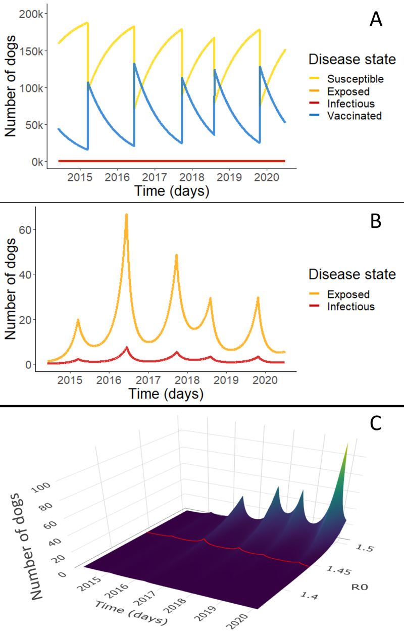
Fig 1. Rabies compartmental model results.
Simulations depict daily point prevalence of each disease state (S,E,I,V). Panel A shows the dynamics of all disease states in the best fit rabies model for Arequipa, Peru. The blue line shows the vaccinated dog population numbers over time and the yellow line shows the susceptible population dynamics. Because the proportion of rabies exposed (pink line) and infected dogs (red line) is so small, these dynamics are not apparent in Panel A. Panel B highlights these exposed and infectious dynamics with an adjusted scale. Panel C shows infected population dynamics for a range of R0 from 1.36–1.5. In other words, it represents the red line of infected population dynamics shown in B but for a range of R0. The trends extend for the full range of possible values of R0 [1.36, 2.0] which can be seen in the supplementary information (Figure D in S2 Appendix).

