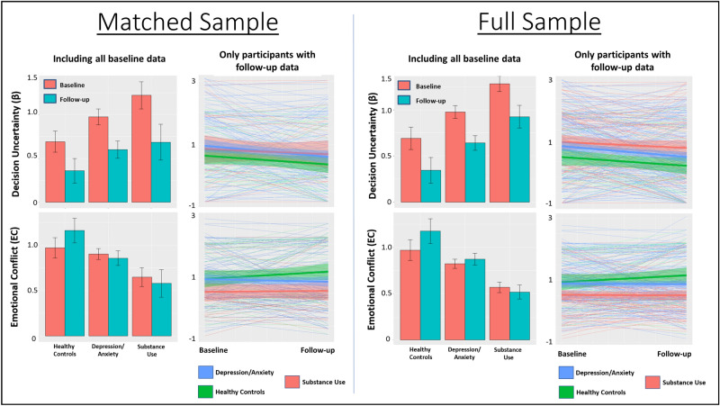
Figure 3.
Means and standard errors for model parameters by clinical group and time in both the propensity matched and full samples. Bar graphs include baseline participant values both with and without follow-up data. Spaghetti plots only include participants with both baseline and follow-up data (thick lines indicate group means, surrounding shading indicates standard error). Comparison of bar graphs and spaghetti plots illustrates that relative differences between groups were somewhat more consistent between baseline and follow-up when including all baseline data.

