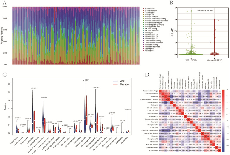
Figure 5.
(A) The stacked bar graph shows the distribution of 22 immune cells in each sample. (B) Differences in the expression of immune checkpoint gene HHLA2 between the LRP1B mutant group and the LRP1B wild group. (C) The violin diagram showed differences in the infiltration of immune cells between the LRP1B mutant group and the LRP1B wild group. (D) The correlation matrix of immune cells. Red means positive correlation, and blue means negative correlation.

