Figure 6.

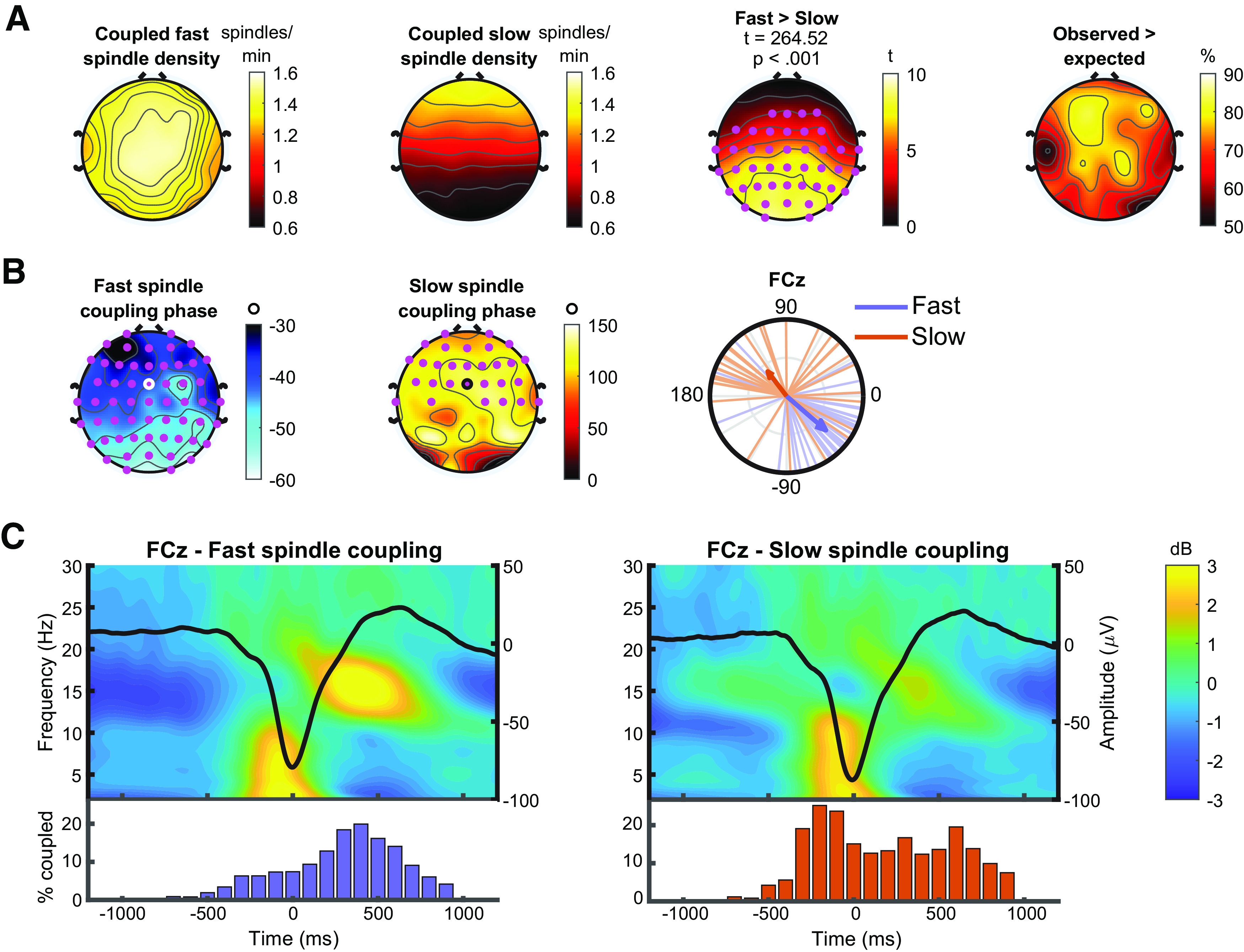
Slow oscillation-spindle coupling. A, Topography of coupled fast (first column) and slow (second column) spindle density, and the difference between them (third column). Cluster statistics presented above topography. Pink dots represent significant electrodes in cluster. Far right, the percentage of participants who exhibited a significantly higher rate of coupling than would be expected by chance. B, Coupling phase. Columns 1 and 2, Preferred coupling phase of fast and slow spindles at each electrode. Pink dots represent electrodes exhibiting significant nonuniformity (Rayleigh tests) at p < 0.05 (adjusted for multiple comparisons using the false discovery rate). Column 3, A circular phase plot displaying phase distributions of fast and slow spindles across participants at electrode FCz (ringed electrode in topographies). Each line indicates the preferred coupling phase of individual participants. The direction of the arrow indicates the average phase across participants, with the length of the arrow indicating the coupling strength across participants. A coupling of phase of 0° indicates preferential coupling of spindles at the positive peak of the slow oscillation. A coupling phase of 180° indicates preferential spindle coupling at the negative trough of the slow oscillation. C, Temporal dynamics of slow oscillation-spindle coupling events. Left, Top, The average time-frequency response of all slow oscillations coupled to a fast spindle (−1200 to 1200 ms, centered on the trough of the slow oscillation), with the time-domain averaged slow oscillation overlaid. Bottom, Histogram indicating the distribution of coupled fast spindles, displayed as percentage of coupled fast spindles, averaged across participants, binned into 100 ms intervals. Right, The same information, but for slow spindle coupling. All analyses performed on electrode FCz (ringed electrode in topographies of B).
