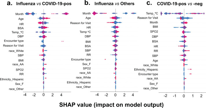
Fig. 3. SHapley Additive exPlanations (SHAP) beeswarm summary plot of SHAP values distribution of each feature of the test dataset.
The plot depicts the relative importance, impact, and contribution of different features on the output of a influenza vs COVID-19-positive, b influenza vs other, and c COVID-19-positive vs COVID-19-negative predictive models. The summary plot combines feature importance with feature effects. The features on the y-axis are ordered according to their importance. Each point on the summary plot is a SHapley value for a feature and an instance (i.e., a single patient encounter in this case) in the dataset. The position of each point on the x-axis shows the impact that feature has on the classification model’s prediction for a given instance. The color represents the high (red) to low (blue) values of the feature (i.e., Age, BMI etc.).

