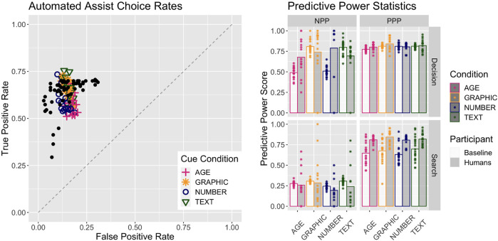
FIGURE 4.
Performance of the Baseline model together with human performance. Human data are from Fallon et al. (2019). Left plot shows the plot of True Positive against False Positive scores; colored icons are the model performance for each condition, and the black dots are the human data overlaid. The right plot gives the predictive power scores for the humans and the Baseline model in both phases and all conditions. Bar heights are the mean values and the points represent either one person or one iteration of the Baseline model.

