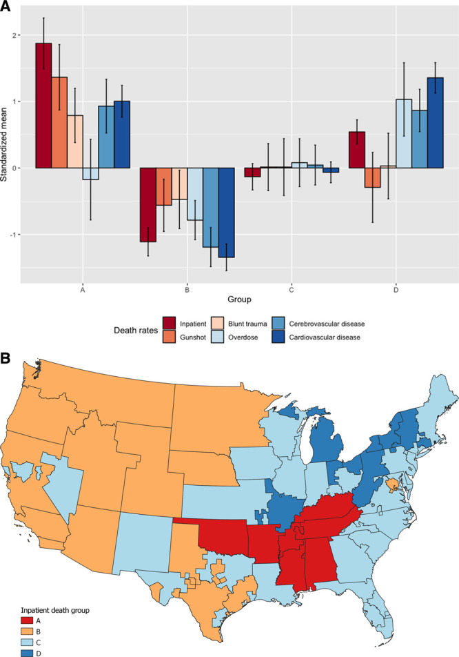
FIGURE 3.

A, Standardized mean values of the component rates of the grouping. Errors indicate a 95% confidence interval. B, Clustered map based on the inpatient death rate for the 56 continental OPOs. The groups were created via a hierarchical spatial clustering method with the inpatient death rate and top 5 causes of donation-eligible death rates within each OPO. Map created with QGIS 3.12.1.
