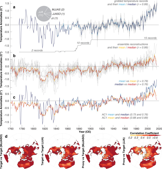
Fig. 3. Measured and reconstructed temperatures.
a Gridded temperature measurements (grey lines), together with their mean and median time-series (see the “Methods” section for details). The pie chart shows the seasonal averages used, and the lower grey solid line refers to the number of records. b Ensemble reconstructions (grey lines), together with their mean and median (orange and red). The mean and median of both, the proxy and target data are statistically similar (r = 0.99). c Measured and reconstructed temperature means and medians. d Spatial field correlations between the mean of all 15 temperature targets and gridded Berkeley data (Target versus Target), and the ensemble reconstruction mean and gridded Berkeley data (Proxy versus Target), calculated over 1794–2016 CE.

