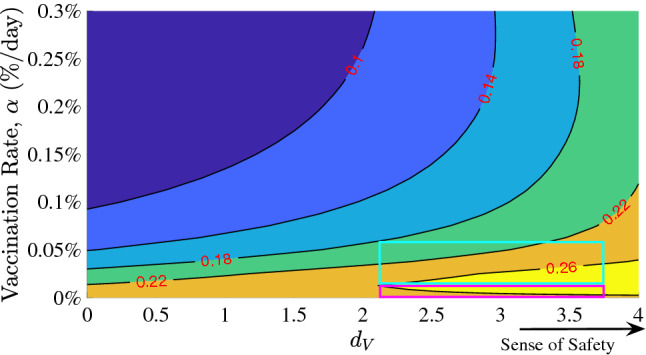
Figure 5.

Contour plot of the sense of normalcy, , and vaccination rate, , versus the total infections since the start of vaccination (red values shown as proportion of the total population). Shown for a high level of caution case ( = 500). The pink box shows a possibility of increasing number of total infected cases with increasing vaccination rate at very high sense of safety, and the teal box shows that once the vaccination rate crosses a threshold, the total number of infection cases drop with vaccination rate even at a very high sense of safety.
