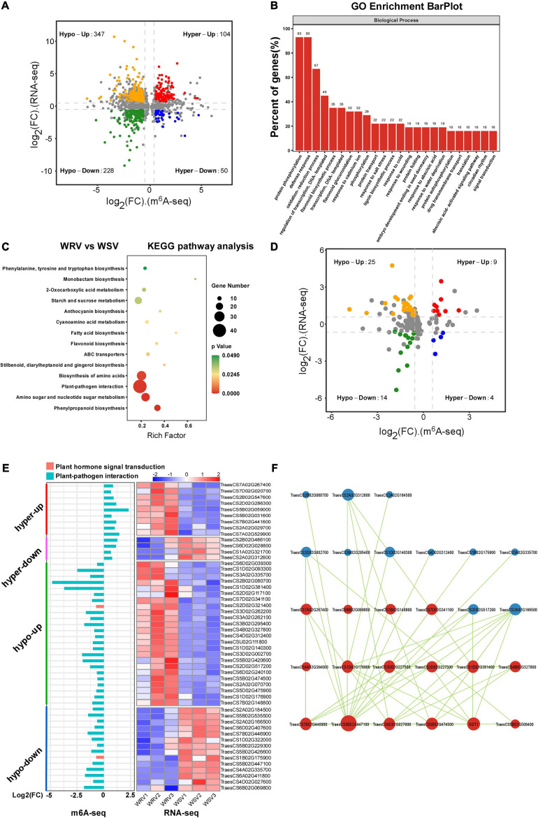
FIGURE 4.
Conjoint analysis of m6A-seq and RNA-seq data. (A) A four-image map to analyze the relationship between differential genes and differential peaks and to screen out genes with a significant change in both m6A and mRNA levels in WRV samples compared with WSV samples (fold change >1.5, p < 0.05). (B) Gene Ontology analysis of biological processes of genes with a significant change in both m6A and mRNA levels. The vertical axis represents the proportion of selected genes enriched in each pathway. (C) KEGG pathway enrichment analysis of the genes with a significant change in both m6A and mRNA levels. The horizontal axis represents the rich factor of each pathway. (D) Distribution of genes with a significant change in both m6A and mRNA levels that were enriched in the plant–pathogen interaction pathway and plant hormone signal transduction pathway (fold change >1.5, p < 0.05). (E) Heat map and bar diagram of “hyper-up,” “hyper-down,” “hypo-up,” and “hypo-down” genes represented in D. Left, m6A-seq; right, RNA-seq. The red column represents genes enriched in both pathways, and blue column represents genes enriched only in plant–pathogen interaction pathway. Red, white, and blue represent upregulation, unchanged expression, and downregulation of mRNA level, respectively. (F) Graph of the protein interaction network of abnormally m6A-modified genes enriched in the plant–pathogen interaction pathway generated with the OmicStudio tool at https://www.omicstudio.cn/tool/56. Red and blue circles represent the source and target genes, respectively. The size of the circle represents the complexity of the interaction.

