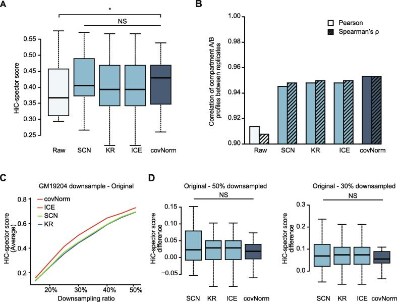
Fig. 3.
Evaluation of Hi-C contact map normalization. (Light cyan: raw Hi-C contact maps, Light blue: baseline methods, Dark blue: covNorm) A. Boxplots showing HiC-spector measured reproducibility scores of Hi-C contact maps between two biological replicates (GM19204 and GM19240) . The proposed method showed significantly higher HiC-spector score compared to the raw data (paired t-test, p-value = 0.019). Normalization methods did not show significant differences (paired t-test, p-value > 0.05, NS). B. Bar plots showing Pearson’s correlation coefficient (left bars, no face pattern) and Spearman’s rank correlation (right bars, dashed face pattern) between GM19204 and GM19240 40 kb compartment A/B profile before and after normalization. The proposed method showed the highest correlation between two biological replicates. C. A line plot showing reproducibility (average of 23 chromosome pairs’ HiC-spector score) between the original and downsampled Hi-C data of GM19204. Line colors indicate each method. The sampling ratio is at 5% intervals from 15% to 50%. The results of ICE and KR overlapped. D. Boxplots showing the chromosome-wise contact map HiC-spector score difference between the original-50% downsampled (left) and original-30% downsampled (right) GM19204 Hi-C data (paired t-test, p-value > 0.05, NS). For the boxplots, the box represents the interquartile range (IQR) and the whiskers correspond to the highest and lowest points within 1.5 × IQR. (For interpretation of the references to color in this figure legend, the reader is referred to the web version of this article.)

