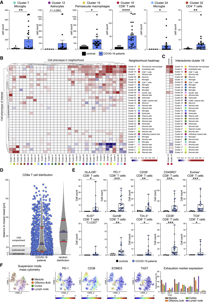
Figure 3.
Spatial profiling of the brain immune response in COVID-19 indicates localized and orchestrated adaptive immune infiltration
(A) High-dimensional annotated cell clusters were compared across patients and controls. Immune cell clusters with significantly different abundances in COVID-19 and control patients are shown by scattered dot plots with bar graphs indicating means ± SEM; each dot represents one patient.
(B) Spatial interactions between each pair of cell types in patients with COVID-19 were analyzed by permutation-based neighborhood analysis. The percentages of images with significant neighborhood interactions are displayed as a hierarchically clustered heatmap, ranging from −0.4 (avoidance) to +1 (interaction). Rows represent the neighborhood of a cell phenotype of interest. Columns indicate the enrichment or depletion of a cell in other neighborhoods.
(C) Cluster c19 spatial neighborhood interactions were determined in COVID-19 and control patients. Columns indicate significant enrichment or depletion of c19 cells in the vicinity of cells from clusters c1–c34.
(D) Distance of cluster c19 cells (blue dots) to the nearest collagen+ or CD34+ vessel was determined in COVID-19 brain sections and compared with a random distribution. The 25th, 50th, and 75th percentiles are depicted.
(E) CD8 T cell activation in the brains of patients with COVID-19. Cluster c19 cells were analyzed for markers of T cell activation, differentiation, exhaustion, and function. Absolute cell counts were compared among patient groups and visualized by boxplots; dots represent samples.
(F) CD8 T cells isolated from medulla, olfactory bulb, cortex, and regional lymph node of a deceased COVID-19 patient were analyzed by suspension-mode mass cytometry. CD8 T cell heterogeneity is shown on a t-SNE map; expression of indicated exhaustion markers is indicated by heatmap coloring. Frequencies are illustrated by bar graphs.
See also Figure S4.

