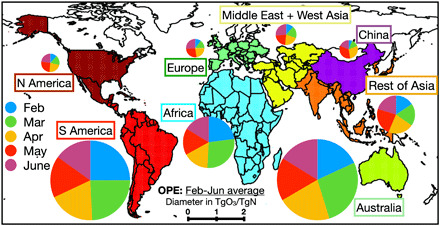
Fig. 7. Global map of the OPE.

OPE is estimated from the change in the global TOB corresponding to the regional COVID NOx emission anomaly. The diameter of each circle represents the averaged OPE value during February to July 2020 in TgO3/TgN, while each sector of the circle represents the relative OPE magnitude for each month. The background map shows the defined areas used in this study.
