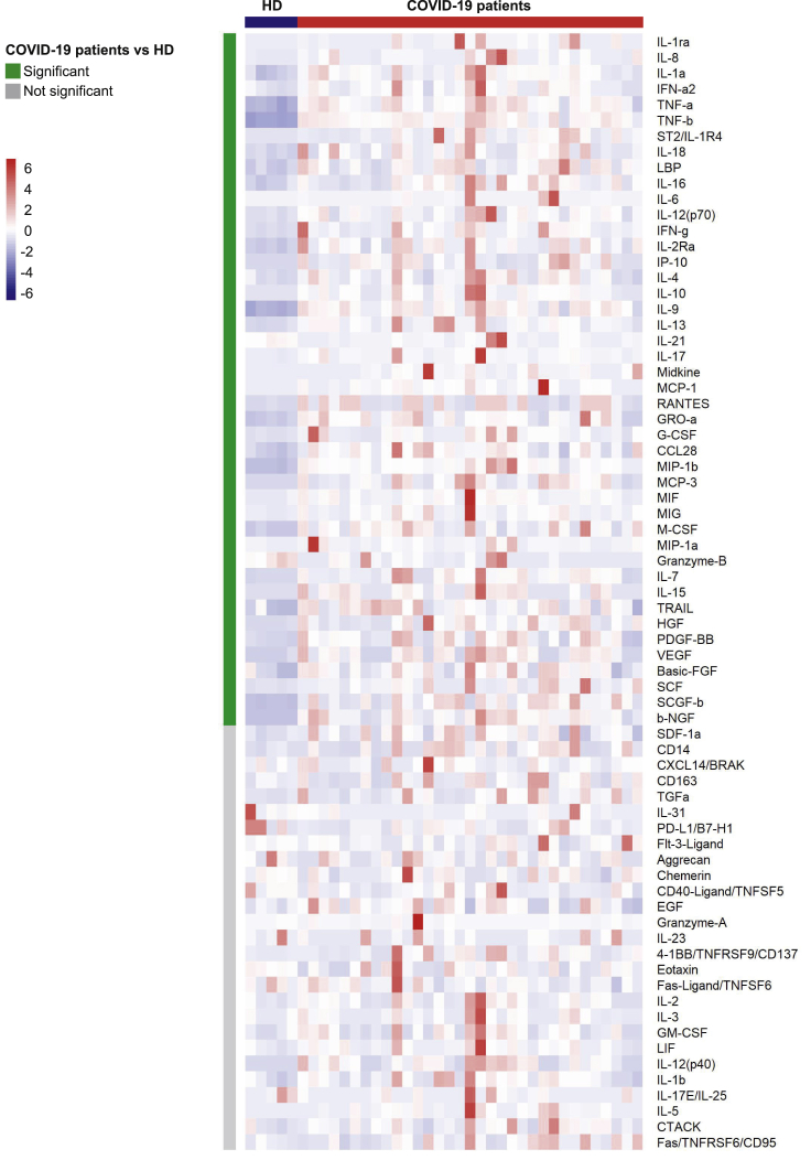
Figure 2.
Heatmap of analyte abundance in serum
The colors represent standardized expression values centered around the mean, with variance equal to 1. HD: healthy donors (n = 5), COVID: patients with COVID-19 (n = 33). Each column represents a subject. Each line represents an analyte.
See also Figure S3.

