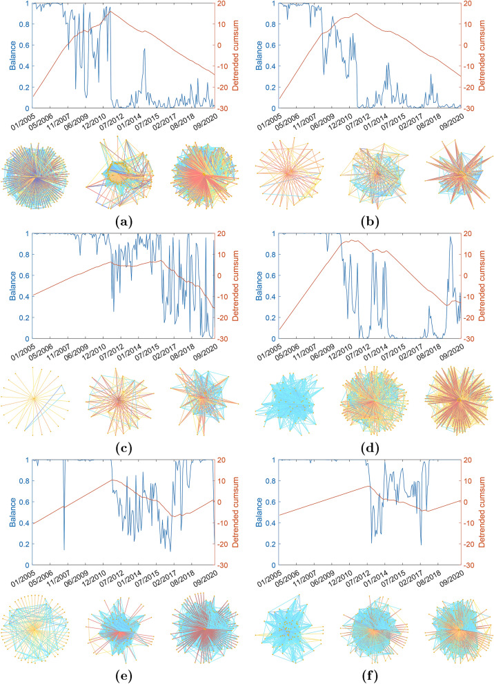
Figure 2.
Balance degree evolution. (a) The US. (b) Portugal. (c) Ireland. (d) Greece. (e) Spain. (f) France. (Top panels) Illustration of the evolution of the balance for the period between January 2005 and September 2020 in the WSSN (blue line) and of its detrended cumulative sum (red line). (Bottom panels) Illustration of three snapshots of representative networks at different times (before, at, and after the BUT). The WSSNs are illustrated using the degree of the nodes as a proxy for the location of the nodes. The most central nodes are at the centre and the low degree nodes are located at the periphery of the graph. The colors of the edges correspond to the Kendall’s tau estimates, with links going from dark red for the most negative to blue for the positive ones. In the Supplementary Information we provide Matlab images of all the networks displayed in the figure where node labels are incorporated. The reader can zoom in these networks for details.

