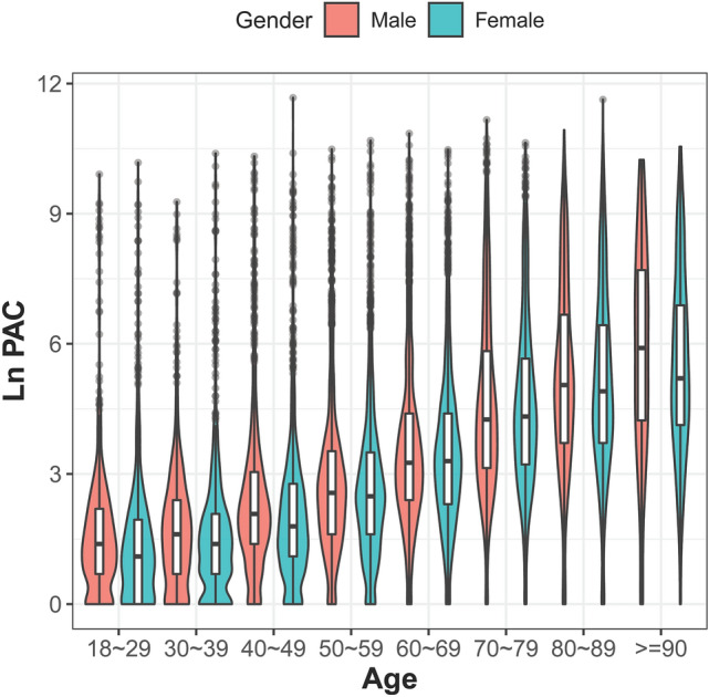
Figure 1.

Violin plot. The PAC distribution is presented by age and gender. The PAC burden increased with age (p for trend < 0.05), and similar distribution across all age bracket was found in both gender. The white bar in each violin plot presents interquartile range, and the central black horizontal line is median. The black lines stretched from the bar are the lower and upper adjacent values defined as first quartile − 1.5 IQR and third quartile + 1.5 interquartile range respectively. The colored area is the density plot, and the width suggests the frequency.
