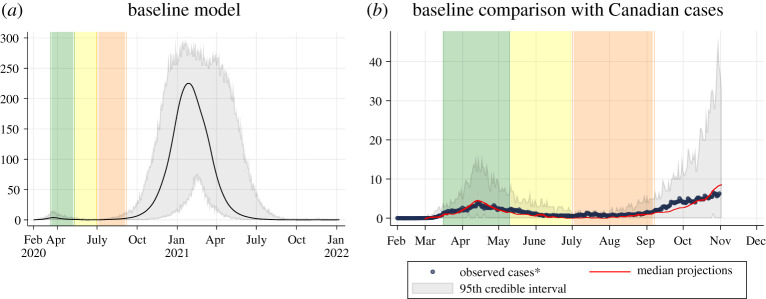
Figure 1.
Baseline scenario. (a) Projected epidemic curve showing daily clinical incident cases per 100 000 people for the baseline model. The black line represents the median value across 50 model realizations. The grey area represents the 95% credible interval across 50 model realizations. The green bar represents 16 March to 10 May (initial shutdown), the yellow bar represents 11 May to 30 June (easing of shutdown) and the orange bar represents 1 July to 7 September (changes in summer). (b) Comparison between locally acquired Canadian cases by onset date (blue dots) and the median modelled clinical cases from the baseline model from 50 model realizations (red line). The grey area represents the 95% credible interval across 50 model realizations. Note that the baseline model was fitted to Canadian levels of interventions up until 8 September (the end of the orange bar) and does not consider additional interventions occurring across the country beyond 8 September.

