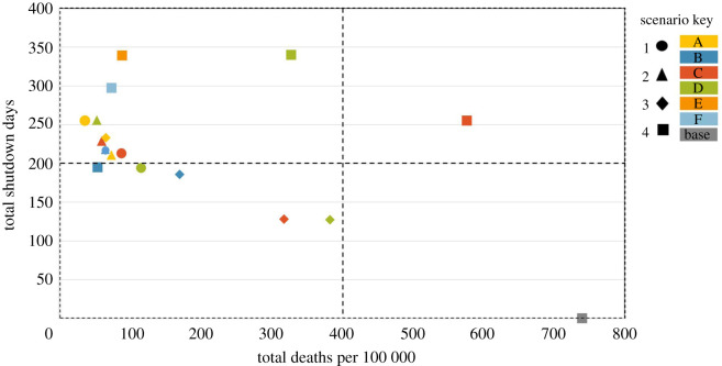
Figure 6.
The health and economic trade-off presented as the ‘price’ of a shutdown day versus the number of deaths per 100 000 for each modelled scenario. The lower left quadrant represents the best trade-off in which the total number of deaths per 100 000 is low and the number of shutdown days is close to zero. Circle markers represent scenario 1 models with colours distinguishing models from each other (A—yellow, B—blue, C—red and D—green). Scenario 2 models are represented by triangle markers (A—yellow, B—blue, C—red and D—green). Scenario 3 models are represented by diamond markers (A—yellow, B—blue, C—red and D—green). Scenario 4 models are represented by square markers (A—baseline model in grey, B—blue, C—red, D—green, E—orange and F—light blue). The majority of markers are in the lower and upper left quadrants as these scenarios specifically model shutdowns as a public health measure to reduce deaths, we, therefore, expect the total number of shutdown days to be high and the total deaths per 100 000 to be low in most scenarios.

