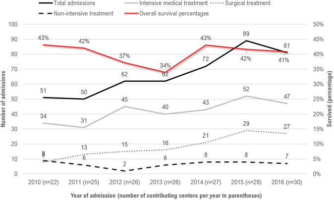
Fig. 1. Time trends in NICU admissions, number of infants receiving intensive vs. non-intensive treatment and percentage of surviving infants from 2010–16 (n = 467).
X-axis represents year and number of centers contributing data to the CHNC in that year in parenthesis. Y-axis represents number of T13 or T18 admissions in that year.

