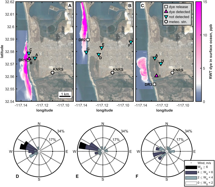
Figure 1. Overview of the three dye releases of the CSIDE study.
(A)–(C) present maximum RWT dye concentrations in coastal waters and aerosol sampling locations and results from each dye release (1–3). Magenta triangles pointing up indicate locations where dye was detected in the aerosol. Cyan triangles pointing down show the locations where aerosol was sampled and dye was not detected. (D)–(F) contain wind roses presenting daytime winds, responsible for onshore transport, for the first 2 days of each DR, when most aerosol samples were collected (4). Stacked bars in the wind roses indicate the percent of the time period the wind blew from the indicated direction and at the indicated speed (represented by color). (1) Zohar Bar-Yehuda (2017). zoharby/plot_google_map (https://github.com/zoharby/plot_google_map), GitHub. Retrieved June 1, 2017. (2) Map data: Imagery ©2020 Google. Data USGS, Data SIO, NOAA, U.S. Navy, NGA, GEBCO, Data LDEO-Columbia, NSF, NOAA, Imagery ©2020 TerraMetrics, Map data ©2020 INEGI. (3) Jonathan Sullivan (2017). Automatic Map ScaleGeneration (https://www.mathworks.com/matlabcentral/fileexchange/33545-automatic-map-scale-generation), MATLAB Central File Exchange. Retrieved June 1, 2017. (4) Daniel Pereira (2017). Wind Rose (https://www.mathworks.com/matlabcentral/fileexchange/47248-wind-rose), MATLAB Central File Exchange. Retrieved June 1, 2017.

