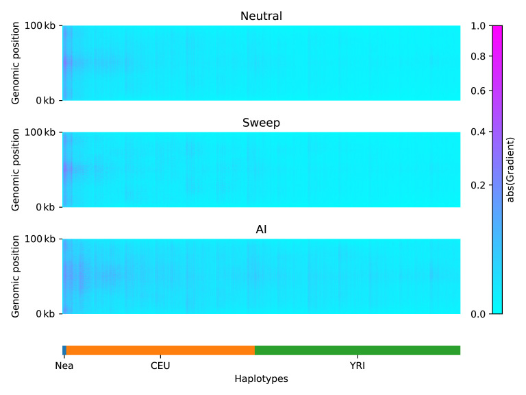
Figure 3. Saliency maps, showing the CNN’s attention across the input matrices for each simulated scenario, calculated for the CNN trained on Demographic Model A, filtered for beneficial allele frequency >0.25.
Each panel shows the average gradient over 300 input matrices encoding either neutral (top), sweep (middle), or AI (bottom) simulations. Pink/purple colours indicate larger gradients, where small changes in the genotype matrix have a relatively larger influence over the CNN’s prediction. Columns in the input matrix correspond to haplotypes from the populations labelled at the bottom.

