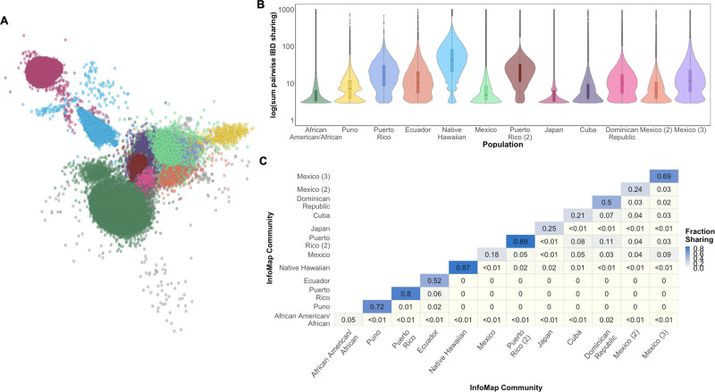
Fig. 4. Network of IBD sharing in the PAGE dataset.
A A network of IBD sharing within PAGE plotted via the Fruchterman Reingold algorithm. Each node represents an individual (edges not shown). Individuals are colored based on community membership as inferred by the InfoMap algorithm. B Distribution of the sum of IBD sharing within the top 16 largest InfoMap communities demonstrates variance in levels of IBD sharing between different communities. Boxplots inlayed within violins depict the median and interquartile range of the within-community sum of pairwise IBD sharing (cM), while the minimal and maximal values per distribution are represented by the extreme tails of the violin plot. InfoMap communities are labeled according to the demographic label that most strongly correlated with community membership (as measured by positive predictive value). Elevated pairwise IBD sharing can be observed in several InfoMap communities, which may represent founder effects. C Heatmap of the population level fraction of IBD sharing within and between the top 16 largest InfoMap communities demonstrates elevated sharing within, relative to between communities.

