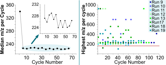
Fig. 6. Experiments compared by the highest m/z value.

On the left, we present a diagram, which shows the median of the highest m/z value of each experiment compared with the cycle number. As the first value is very high, a zoomed-in version of the plot is shown as an inset. On the right, we show the highest m/z value over the threshold of each cycle of selected runs. The line (red) in the plot represents the m/z value of the heaviest input solution.
