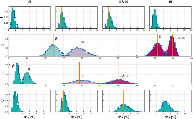
Figure 8.
Risk assessment for the involvement of different LNLs (rows), given positive observational findings in specified LNLs (columns or labels next to histograms). E.g. row 3 depicts the risk of involvement in LNL III, given different observed involvements (from left to right: no involvement, LNL II only, LNL III only, and LNL II and III but no others). The orange line depicts the maximum likelihood result from (Pouymayou et al.)31, the blue outline histogram represents the BN sampling solutions and the solid coloured histograms are the results from the HMM. The colour goes from green (low risk) to red (high risk). Of 200,000 parameter samples, 2% were used to create this plot.

