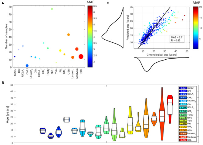
Figure 3.
Performance of DNN models: (A) bubble plot where each bubble represents a site, the color codes the average MAE values of the subjects within each site and the radius is proportional to the average age of the subjects within each site, the y position indicates the number of samples within each site; (B) violin plots of the age distributions of the subjects within each site (the colors indicate the average MAE values for the subjects within each site); (C) scatter plot showing the chronological age of the subjects vs. their predicted age with the marginal distributions (the black solid line indicates the ideal model and the color of each point codes the average MAE for the corresponding subject). The performance for the whole dataset are also reported by means of the MAE and R-values.

