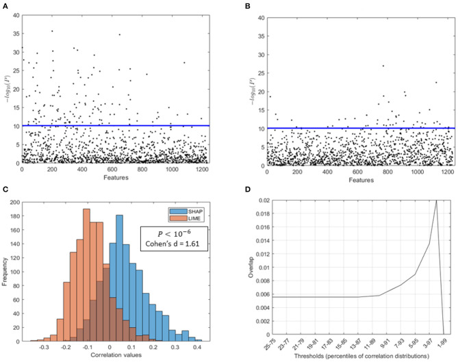
Figure 8.
Comparison of SHAP and LIME scores. Manhattan plot representing the p values resulting from the correlation analysis between (A) the SHAP scores of the features and the age of the subjects, (B) the LIME scores of the features and the age of the subjects; (C) distributions of correlation values found between the SHAP/LIME scores of the features and the age of the subjects; (D) overlap between the most significant features for the two criteria (SHAP/LIME) selected by varying the percentile threshold of the correlation distributions.

