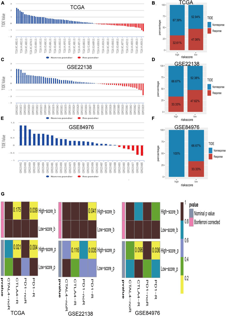
FIGURE 8.
Immunotherapy response of UM. (A) Bar plot for the distribution of tumor immune dysfunction and exclusion (TIDE) scores in TCGA dataset. (B) The percentage of immunotherapy response between the high- and low-risk groups in TCGA dataset. (C) Bar plot for the distribution of TIDE scores in the GSE22138 dataset. (D) The percentage of immunotherapy response between the high- and low-risk groups in the GSE22138 dataset. (E) Bar plot for the distribution of TIDE scores in the GSE84976 dataset. (F) The percentage of immunotherapy response between the high- and low-risk groups in the GSE84976 dataset. (G) Submap analysis of different responses for anti-CTLA-4 therapy and anti-PD-1 therapy between the high- and low-risk groups in TCGA, GSE22138, and GSE84976 datasets.

