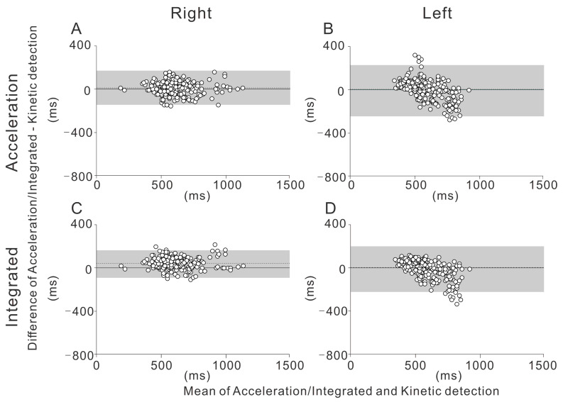
Figure 3.
The Bland-Altman plot depicts the differences between the different detection methods in the curve, with 95% limits of agreement. The mean difference is shown by the dotted line. The 95% confidence intervals of the limits of agreement are also depicted (gray-shaded area). (A) Acceleration detection on the right side. (B) Acceleration detection on the left side. (C) Integrated detection on the right side. (D) Integrated detection on the left side.

