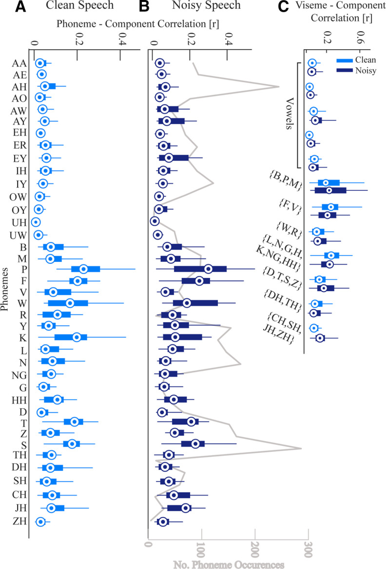
Figure 5.
Correlation between phonemes and visemes time series with the first CC. A, The correlations for each phoneme from the clean speech data. B, The correlations for each phoneme from the speech in noise data. The gray line plots the number of phoneme occurrences to show that it is not the case that the most frequent phonemes dominate the data. C, The correlation between each viseme (groups of visually similar phonemes) and the first component. The compact version of MATLAB's boxplot function is used here (for description, see Fig. 4 caption).

