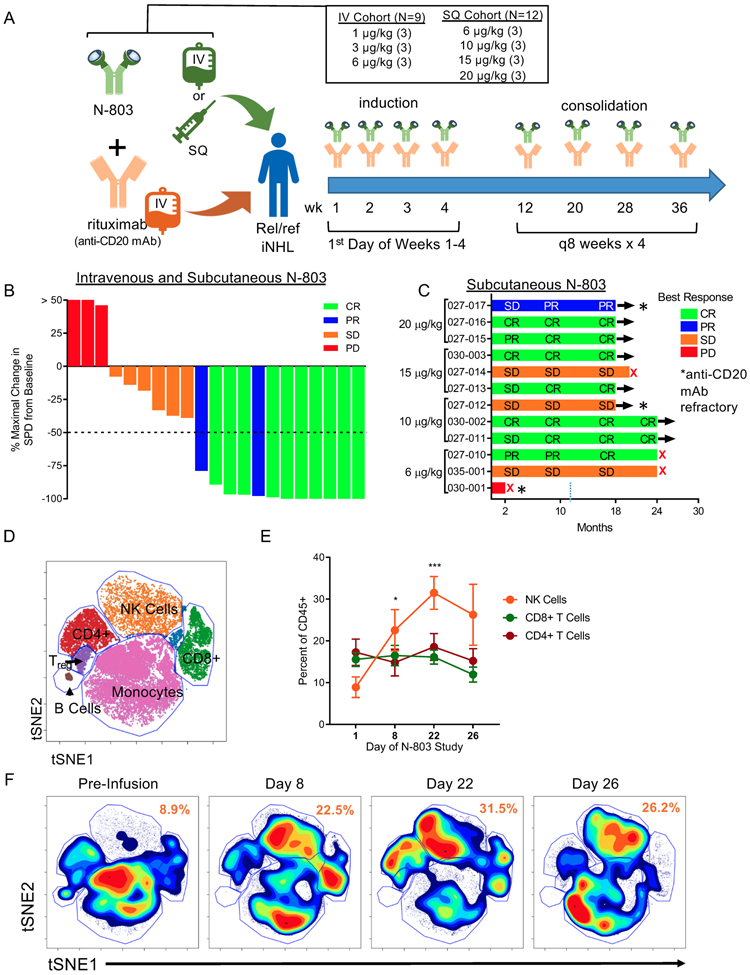
Figure 1. N-803 and Rituximab induce clinical responses and immune modulation in a Phase 1 trial.
A) Schematic of the phase 1 clinical trial and dosing regimens. B) Waterfall plot depicting the percent maximal change in the sum of the products of the greatest diameter (SPD) of the lymphoma tumor burden and the best clinical response for all patients in the IV and SQ cohort by color. n = 21 C) Swimmer plot for SQ N-803 patients depicting best clinical responses across follow-up by dose. n = 12. Red X denotes PD. * denotes rituximab-refractory patient. D) Representative tSNE visualization of major immune cell lineages in high-dimensional mass cytometry data. E) Percentage of NK, CD8+ T cells, and CD4+ T cells in patient PBMC pre-treatment (D1) and during N-803 and rituximab treatment (D8-22). Mean ± SEM depicted. n = 5, 3 independent experiments. 2-way ANOVA with Dunnett’s multiple comparison’s test. F) Representative tSNE density plot of PBMC lineages across time. Numbers in orange denoting mean of NK cell percentages across time. * = p < 0.05, ** = p ≤ 0.01, *** = p ≤ 0.001, **** = p ≤ 0.0001.

